A realist painter and one of the most popular American artists of the past century Andrew Wyeth once noticed: “Don’t overdo it, don’t underdo it. Do it just on the line.” That said, know when to stop because everything in the art, business, feelings and other aspects of life has the line that shouldn’t be trespass. The same adage can be applied to the digital world as well. When people try to create a truly remarkable, profitable and friendly website or app, sometimes in an effort to stand out from the rest they forget about the golden mean and destroy the end result. Have you ever faced such a problem or just want to try to avoid it down the track? So, you are in the right place!
After searching long and hard, you have found the best WordPress theme for developer blog and customized it to your needs, but the end result doesn’t look anything like the live demo of the theme. Why? The demo looked fascinating. The theme was packed with a set of amazing features and plugins. You bought it, installed with no effort and started to adjust to your personal or client’s needs. You selected the icons, changed the web font and color palette of the theme, inserted slider, and content, arranged gallery and added tons of visual elements and other design tricks to decorate the end result, but voila – the website doesn’t look like the demo. Something went wrong, but you have no idea exactly what!
If you ask a professional designer, working in WordPress theme business for several years: what’s the matter? He might answer that he saw countless examples of perfect sites based on WordPress themes and not fewer patterns of the websites where a couple of small design mistakes ruined the overall appearance and performance. So, take a look at 10 common design mistakes that can be easily fixed by anyone. When you remove or avoid these small yet important imperfections, the result will look more pleasing and professional.
Web Design Mistakes That Can Destroy Your WordPress Blog
Too Much Creativity

Is creativity bad? No, it’s perfect for any sphere of life but indulging in a large portion of it can have a negative effect and unpleasant consequences. As mentioned above, everything is OK to a point, and the key is understanding where that point is. Extra creativity can harm your users’ experience and kill your design.
People by default are lazy and look for the easiest ways to achieve their goals. The same rules when coming about website design. Users will prefer a site with an intuitive interface, smooth performance, and legible, eye-pleasing overall look. They abandon complicated, slow-loading, intricate online platforms that make them puzzled. Google’s research showed that users like sites that look familiar or highly prototypical, so that do not contradict users’ expectations. Remember the structure of the most blogs:
- To the left, there is a header with logo.
- To the right, there is a header with the navigation menu.
- To the right, there is a sidebar with a Call-to-Action area.
- The main content places to the left in the body section.
This blog structure is not an obligation, but it’s a prototypical image of a blog layout. People intuitively look for some website details (for example, for signing up in the right top corner), and as a rule, they are very disappointed having not found them there. Your blog is aimed to make users’ life easier but not vice versa. Design with a prototype in mind.
Low-Contrast Text on Sliders

Poor contrast text may be trendy and modern, but it is also illegible and unhandy. Sliders are aimed to grab visitors’ attention at the main topic of the blog, products at the e-store or other essential things on the website. If your slider images contain the text, follow the rules:
- If the background is dark, choose white or another light color for the text on the slider and vice versa.
- Insert the text in the area on the image where it would be legible and noticeable. Visual noise in the background will make your text invisible and poor.
Correct Spacing
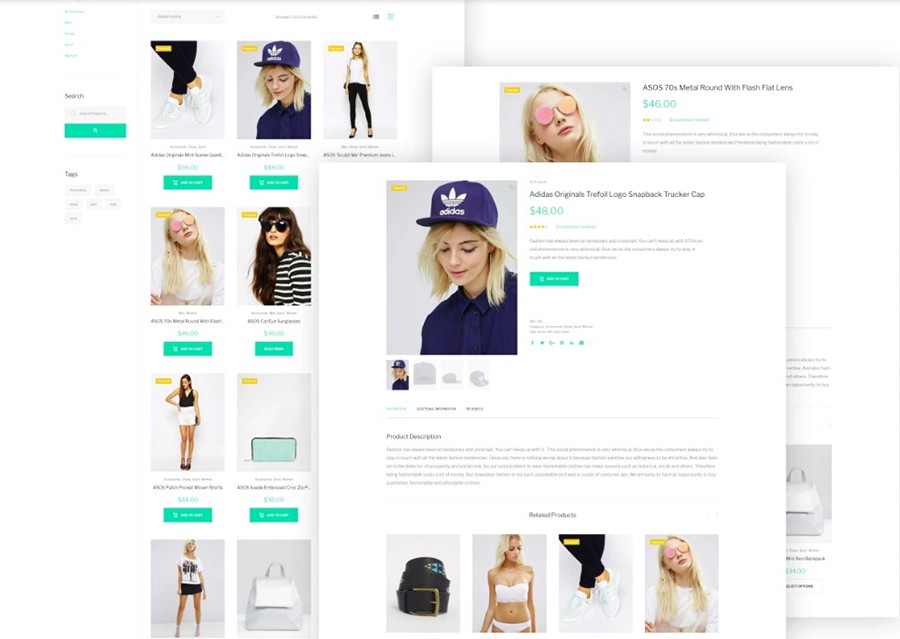
Website design must be well-thought and well-organized. That can be achieved with the help of reasonable blank or white spaces between widgets, images and other elements of web pages. These practical examples will help you organize all the widgets and content and deliver a legible, logical flow for the user:
- The more white spaces you apply, the better information on your site is perceived. Allow the content to breathe. Don’t overlap the content, structure all the elements using enough white space.
- Spacing plays a huge role because with the right measuring it’s possible to show the relationship between different elements. For example, the title, subtitles, and paragraphs of one text should be closer together while the space between header and the post has to be bigger.
- Keep a balance with spacing. Each widget should have an equal amount of space from all the sides. Such an approach in designing provides neatness and helps to draw focus on the thing that matters – call to action, content, and more.
Using premium WordPress themes, it is easy and handy to make consistent and reasonable space thanks to a powerful Page Builder and other modern modules built-in. The tool allows adjusting the spacing across the website to your needs in an instant.
It Is Matter of Size

If you think that the larger slider images, the higher conversion is, you are wrong. If you have a photography or designer blog/portfolio, big slider images are acceptable because they are your end product. However, being involved in other spheres it is recommended to use the smaller size in order to achieve a website’s perfect visual balance. Additionally, uploading images of huge size will slow down your load time that has a bad influence on SEO.
Logo Imperfection
The logo is crucial for any business as it serves as an important part of branding. All clients desire to have a truly remarkable logo to sink into the minds of visitors. They ask designers to make it bigger, but your task is to explain to your client that users come to the site not to see how the logo is beautiful. This important element of your site design has to play harmoniously with other content. As for example, take a look at the logo of major global brands. They look gorgeous yet have small size because function as a tool to inform users which brand stands behind the website.
Moreover, your logo has to be pixel-perfect so that try to meet requirements of the theme maker.
Too Many Plugins
There are tons of available WordPress plugins for all occasions. However, the more plugins you download, the more problems you can face. Some of them can cause conflicts with your theme resulting in slow-loading of pages. That’s why prior to using any plugin ask if it’s possible to achieve what you want without it. Besides, consider the following factors as well:
- The number of downloads: the more people downloaded that plugin, the more times its quality was proved.
- Check when the last update was. If it has not been updated for 2 or more months, its support is poor and it’s better not to use it.
- Take a look whether a plugin is supported by its manufacturer.
- A plugin has to be tested with the latest WordPress version. If you are not sure whether it is compatible with it, your website might have conflicts with it.
At last, after installing the plugin into your WordPress theme, don’t forget to look how it works on the front face.
Poor Image Quality

One of this year web designing trends is using the engaging photographic content. That said, visitors will wait for your website appealing, interesting, and high-quality images. If you have an e-commerce website, quality images of products are must-haves. Try to avoid unrealistic and extensively polished pictures because they won’t make an appropriate impact on visitors.
The Elements of Bad Typography

Today web tends to typography, variable fonts, typeface design. Good typography is able to create personality and evoke emotion. With big, bold fonts, it is possible to set the tone on a website and convey important information. 95 percent of web design is typography so your choice has to be deliberate. Pay attention to widgets used in the demo of the WordPress theme. Developers made effort to pick up an appropriate font with focus on high-level readability. However, if you want to edit the layout font and style to your needs, consider these simple rules:
- Each and every line should consist of about 60-80 characters with spaces.
- The text needs to be showing up on the page so that try to leave enough space around it.
- Avoid too light colors, everything brighter than #777777.
- Don’t use the font smaller 14px, it is preferable to choose 16-18px.
- If you use custom fonts in the theme, bear in mind that some fonts are designed especially for headings and work awfully on smaller sizes while some fonts are made for prints only. Think twice prior to choose the proper font.
- As for the correct text alignment, mostly left alignment is preferred (95%).
Typography serves an excellent tool for establishing an information hierarchy. By using different font types, sizes, and colors, the readers can determine the most important points of your content. Particularly typography can change the overall appearance and feel of a site or presentation. For this reason, use clean and clear fonts and follow theme maker’s recommendation in order not to destroy your end result.
Non-Responsive Website Design
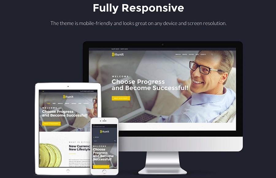
Just imagine, according to a survey, 40 percent of users have abandoned one website in seeking a better experience on the competitors’ websites because of a poor mobile responsiveness. If your site is not a mobile-friendly, users will be discouraged and leave it. That’s why use premium WordPress themes that are 100% responsive and highly adaptive to any modern device with any screen size.
Except for the above-mentioned rules, for mobile websites there are some additional issues:
- Mobile design has to be finger-friendly: clickable buttons with the size above 50px, readable content. Check all the actionable components in order to prevent misclicks.
- Optimize image size to avoid a slow site loading and make effort to accelerate page loading on the mobile.
- Prior to making your site mobile accessible, test t how it looks and works on the actual mobile device.
TemplateMonster WordPress themes are carefully crafted with the mobile first paradigm. All of them flow freely on small mobile screens without compromising on quality.
Using Poor Color Combination

It seems tricky to choose the right color combination. If you are not sure in your capabilities, use special tools that can help you choose secondary colors for their primary match. Don’t use too many colors for one website since it has to have a consistent, unified, and elegant look. Extra bright or extremely colorful website will irritate and make people leave your page. Remember, for better perception you should use one or two colors dominating the web page.
Bloggers are ranked as one of the third most trustworthy sources of information, following only friends and family. That’s why your WordPress blog has to look the part – professionally, user-oriented, mobile-friendly, trustworthy, engaging and gorgeous. Except for the look, it needs to have a smooth user interface and provide the robust user experience. However, if you have made one or several above mentioned mistakes, you can lose the audience loyalty in a moment.


