If you’ve fine-tuned your SEO strategy and have been doing a great job of promoting your products on social media, you might be getting more website visitors than ever before. But your work doesn’t end there — once people land on your website, you need to convince them to spend their money with you.
If you’ve noticed that your website has a particularly high bounce rate or a lot of people are stopping by but you’re getting very few conversions, it’s probably because your landing pages aren’t optimized.
Fortunately, there are some tricks you can use, from choosing the right images to including a strong call-to-action, which will increase your chances of making a sale. So, here, I’m going to talk you through my top tips for ensuring your landing pages are up to the job of boosting your conversions.
And, if you’re reading this article because you’re preparing to set up a brand-new website for your business, make sure you also read Joomdev’s guide to getting started.
Powerful Landing Page Techniques
Add strong calls-to-action
A call-to-action, or CTA, is a phrase that tells your website visitors exactly what you want them to do. So, you might tell them to subscribe to your newsletter, start a free trial, or buy now.
If you think it’s already obvious what you want your readers to do, or you’re afraid of seeming too pushy, you might be tempted to leave your landing pages CTA-free. But they really do make a difference, so you should never create a webpage without one.
When you’re adding a CTA to a landing page, you need to ensure it’s optimized so you can boost your conversations as effectively as possible. Always create a sense of urgency, make your call-to-action stand out with a bright color, and highlight any USPs you have so people know why they should spend their money with you, rather than your competitors.
You’ll see even better results if you’re able to create personalized CTAs for your site, too. In fact, these perform 202% better than standard calls-to-action, according to data from HubSpot.
Never miss the chance to tell your prospective customers what their next step should be.
Use the right images
Nobody wants to click on a link, only to be faced with a boring web page with a wall of text. So, to keep your website visitor’s interest, you need to make your landing pages look a lot more exciting with the right images. Not only should they be eye-catching and relevant to your webpage, but they should also add value.

BarkBox does a great job of using images to convince its target customers to make a purchase. With this one image, they’ve been able to show what their furry customers can expect to receive in the mail, created a sense of urgency with the “limited time only” note, and shown just how excited a pup will be when they receive their treat.
Any good dog owner would be seriously tempted to click “buy” after seeing this because you get a real sense of just how exciting these products are.

GroomsShop is another business that uses images very well, especially on its homepage. As soon as someone lands on the site, the first thing they see is an image that creates a sense of aspiration and excitement.
In the lead-up to their wedding, every man imagines what he’s going to look and feel like when he’s dressed in his best suit and flanked by his closest friends. This image does a fantastic job of showing prospective customers how great they’ll look and feel on their big day if they decide to spend their money here.
Don’t forget that, especially in the age of mobile search, it’s incredibly important that you use flexible images on your site so they’ll adapt to the screen of the device someone is using. Whether your website visitors are browsing the web on their desktop, or they’re having a quick scroll on their smartphone, you’ll want them to have a positive experience, or they’ll be very unlikely to buy your products.
Target the most relevant keywords
If you’ve been trying to boost your search engine rankings, you might have already started targeting specific keywords with your content. But, one of the most common SEO mistakes business owners make is that they simply target any slightly applicable keywords with large search volumes, when they should be putting more thought into their research.
If the keywords you’re targeting on each of your web pages aren’t completely relevant, people might be disappointed when they land on your site because they were looking for entirely different products or information. So, you need to be looking at more than just the search volumes of keywords you’re thinking about weaving into your content.
Perhaps the most important factor you need to keep in mind is searcher intent. For example, if you run a clothing brand, you’ll target different keywords on your product pages and in your blog posts.
For instance, if you’re creating a jeans buying guide, you won’t want to target the key phrase “blue jeans”, because people searching this will be looking to make a purchase, rather than searching for information. Instead, you’ll want to target phrases like “how to know which size jeans to buy” and “most versatile color of jeans”.
At Loganix, we have a guide to question keywords that explains more about this. Make sure you check it out if you would like to learn more about searcher intent and how to target the ideal keywords and phrases on every page of your website.
You should also use reputable keyword research tools to ensure you’re getting the most accurate information about which phrases to target. Google Keyword Planner, Answer The Public, and the Ahrefs Keyword Generator are all great options.
Give your audience a sense of FOMO
Fear of missing out, or FOMO, can be a fantastic motivator. So, it’s well worth trying to generate a sense of this with your landing pages.
There are a number of ways in which companies do this. For example, some provide real-time stock updates so prospective customers can see when supplies are low, and other companies update their website visitors when someone else has checked out. Plus, as Joomdev explains in their guide to creating Christmas sales pages, adding a countdown clock to your landing pages can make people very aware of the fact they could miss out on the deal you’re running if they don’t act now.
If you have the data to back it up, you could also use your landing pages to let visitors know people just like them are using your products or services.

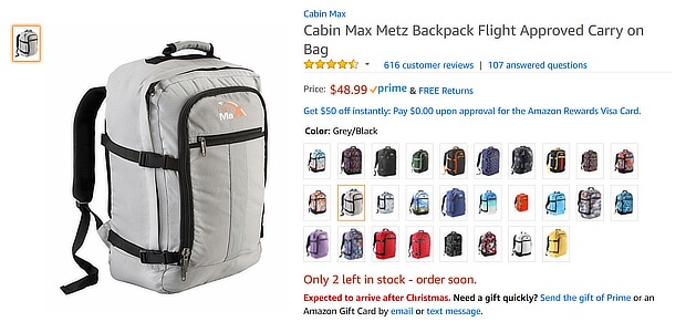
For instance, Amazon provides constant stock updates to show that a lot of people have already bought and are enjoying their products. As you can see here, there are only two of these backpacks left. Nobody would want to be the third person in the queue who ends up missing out on the bag they want, so this technique will convince a lot of people to check out as soon as possible to avoid it.

FreshBooks also does a fantastic job of creating a sense of FOMO on their free invoice templates page. Just above the “create my free invoice” button, they include a note that says “join 24 million people who have used FreshBooks invoicing”. This creates a sense of trust because it shows that millions of people have relied on the company to help them get paid. Plus, it’s likely to give people a fear of missing out on the action, which will motivate them to use the company’s templates.
Make it easy for prospective customers to get in touch
If a prospective customer has a question or concern and can’t find an easy way to get in touch with you, they’ll be far less likely to spend money with your business. So, it’s important that you provide your website visitors with several ways to contact you.
Some people might prefer a traditional phone call, while others may want to send you a detailed email with all of their concerns. And, increasingly, companies are offering their customers a live chat option to answer questions quickly and effectively directly on the landing page they’re looking at. Providing a live chat on your landing pages can actually improve customer satisfaction levels by 73%, according to Acquire, so you might want to consider adding this option to your site if you’re looking to boost your conversions.
It’s a good idea to make sure you’re accessible on social media, too, as some people — and especially young customers — might want to get in touch through the likes of Facebook, Instagram, and Twitter. Make sure you regularly check your mentions and direct messages to avoid missing anything important.
Create landing pages that offer a positive user experience
You want people to stay on your website long enough to make a purchase. So, you need to ensure they have a nice experience while they’re there. As a result, you’ll want to fine-tune your navigation, ensure that everything is easy to read, improve your accessibility, and make sure there’s nothing that’s slowing your website down unnecessarily.
You should also check that your website is mobile-friendly, and make any appropriate tweaks if it isn’t. More and more people are using their smartphones to browse the internet, so you need to ensure your site works perfectly on any device to keep everyone happy.
Show your value above the fold
The first thing any customer wants to know is what you can do for them. What do you sell, and why should someone spend their money with you, rather than your competitors?
Don’t make your visitors read a long introduction and scroll around your website to find out what you can do for them. All of your important website information should be front and center.
Prices, main product benefits, and information on how to make a purchase are all things that should be above the fold. Put yourself in your customers’ shoes and think, if you were looking for a product to buy, what are the first few things you would want to know? And how much time would you want to spend looking for that information?

For instance, take a look at this page from Tipalti. Right off the bat, you’re told why the company is unique, what problems they’re aiming to solve for you, and how you can get started with them. It only takes one glance.
Because customers are presented with the most important information straight away, it’s likely they’ll be far more tempted to click that “get started” button.
The website of Kennedy Blue, a bridesmaid dress retailer, is another great example. In the image, you can see several women with different body types wearing a number of different styles of dress. Additionally, the copy shows their low price and you can see that there’s a “try on at home” option for convenience.
You’re given so much great information without even having to scroll, which could convince potential customers that this is the bridal shop for them at a glance.
If you’re not familiar with the ins and outs of good web design, you might have some trouble figuring out how to get the most out of your landing pages. Take a look at Joomdev’s list of things to keep in mind when designing a website, which will help.
Summary
If you’re getting a lot of website visitors, but they aren’t staying long enough to make a purchase, your landing pages are probably to blame. But, if you start using strong CTAs, choose your images carefully, target the most relevant keywords, and allow your customers to get in touch quickly and easily, you’ll be well on the way to hitting your next sales goal!


