Ecommerce category pages are your web pages where you group together similar products to make it easy for your customers to browse them. If designed properly, they can help to boost your business’s sales.
Whether you’re using pre-made templates or building your category pages from scratch, you’ll need to know how to optimize them. So, here are 5 tips that can help you design category pages that convert.
Designing Ecommerce Category Pages
Always dedicate some space to social proof
Word-of-mouth recommendations are very powerful, and you can replicate them by providing social proof on your website. Examples of social proof you can provide include customer reviews, testimonials, and even media mentions.
Adding reviews to your site can also be good for your SEO, as search engines only like to send their users to trustworthy websites, and social proof can indicate that you’re great at what you do.
To help you understand how to effectively display reviews on your website, here’s an example from a business that does a great job of using social proof on their eCommerce category pages to build trust and make more sales.
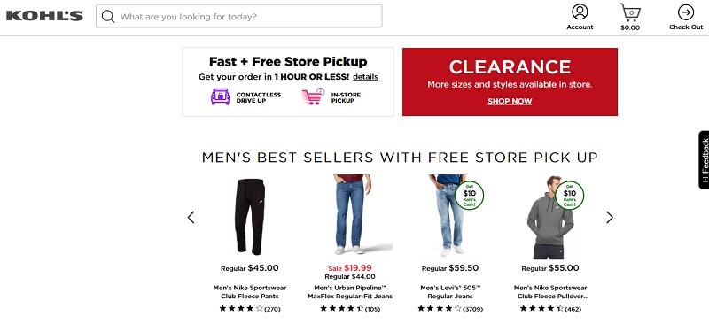
Kohl’s is an eCommerce site that sells different products ranging from menswear to beauty products. And, on their category page for men’s clothing, you can see that they’ve included star ratings to show how previous customers feel about these products.
This is a great way of displaying social proof that people can conveniently see while scrolling through their category page. These ratings can influence prospective customers and lead them to convert, thus increasing sales for the business. Plus, this approach is particularly great for helping your customers to compare similar products so they can make the best possible buying decision. So, it’s well worth considering whether you should replicate this on your own site.
Make it easy for customers to contact you from your category page
Prospective customers might arrive on your eCommerce category pages and then realize they have questions or concerns that will need to be addressed before they make a purchase. You can help them to get over this problem by making it very easy to contact you.
You should try to give multiple communication channels, and also allow people to contact you directly from the webpage, either with a contact form or a live messaging service.
Let’s take a look at some examples of sites that do this well to provide inspiration
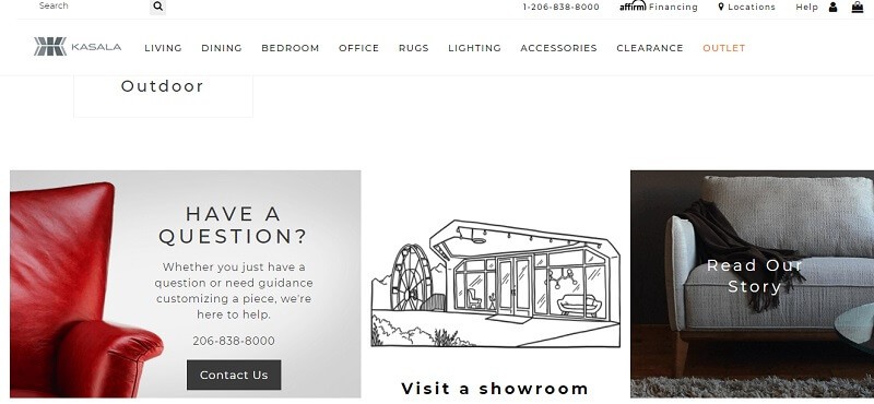
For instance, Kasala sells home and office furniture like desks, beds, tables, and chairs. And, they know that people may have various questions when deciding what product to buy. As a result, they’ve provided multiple contact options on all their category pages.
For instance, on their category page for living room furniture, there are various ways for people to contact the company. They’ve included a phone number, a live chat feature, and a button that leads them to a contact form so prospective customers will be able to ask questions about the items they want to buy. And, once people are able to get their questions answered, it’ll make it easier for them to buy from the company.
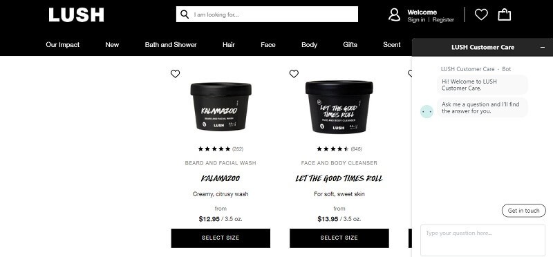
Another example is from Lush, a company that provides fresh handmade cosmetics. They sell products for the body, hair, and face.
Looking at their category page for cleansers and scrubs, you can see a live chat messaging service. This feature is really great for customers who might have specific questions concerning the brand’s products and the ingredients they use.
Nowadays, people are very particular about what they put on their skin and hair. So, if the company is able to answer customer queries quickly and with enough information through the live chat feature, it will help their prospects to make a decision faster and lead to more orders.
As you can see, providing people with easy ways to get in touch is very important for increasing conversions. If you want to add a contact form to your site and you don’t know how, try using JD Builder Pro, Joomla’s form builder. It doesn’t require you to know any coding and comes with ready-to-use templates.
Make sure your product images are of a very high quality
According to Venngage, 40% of businesses rely heavily on using visuals as part of their marketing strategies. So it’s important that you put plenty of time and energy into getting your product photos right, as they can make or break a sale.
To ensure you have great photos for your site, make sure you use good lighting to take your pictures. Also, you should try to show people using or modeling your products, especially if they are clothing items or accessories. Lastly, make sure you are optimizing your images with an alternative text to give search engines more context about what your images show.
Here’s an example of a business that does a great job of taking high-quality images of its products.
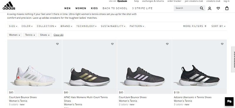
Adidas is a company that’s well-known for its high-quality and comfortable footwear. And, to show how well-designed their products are, they make sure to use professional quality images.
Looking at their web page for women’s tennis shoes, you can see how the pictures look like they’ve been taken in a studio with professional lighting and in different positions so people can see how the shoes look from various angles. Using these quality images will make people rate their products higher and that will encourage more prospects to buy and convert into customers.
High-quality photos can work for virtually any business in the eCommerce industry and, as I’ve mentioned earlier, you can opt for working with models if you sell clothing items. Even if you sell other types of products, like household items, for example, try to invest in professional photography sessions to give prospective customers the best view of your products.
Make it easy for customers to jump to related categories
If customers land on a particular category page and can’t quite find what they’re looking for, it doesn’t need to mean all is lost. As long as you design your category page well, you could lead them to a similar category that might offer just what they need. And you can do that with internal links.
Internal links offer a great way to elevate the customer experience because they give people access to more information or products that they might not have even known they needed.
You want to make sure you’re doing what you can to provide the best customer experience (CX) for website visitors, as providing a great customer experience is one of the most important marketing skills for businesses at the moment. This means, if you’re not making use of internal links, it’s time to start doing so.
When including internal links on your category pages, try to do it in a way that will encourage people to click on them. For instance, you should ensure that they stand out by using a different text color than you do for the rest of your content. Also, the anchor text you use for your internal links should be relevant to the page you’re linking to and, if possible, make sure you choose a position that makes the links easy to find.
If you’re offering a promotion, make it obvious!
A lot of the time, eCommerce sites won’t publicize special discounts or promotions until someone lands on the product page it applies to. However, this can prevent you from securing sales from people who are currently on the fence about shopping with you, as a discount might just be enough to push them over the edge.
Highlighting your promotions is one of the powerful landing page techniques that can help you boost conversions and sales. So, whenever you’re offering a particular promotion, you need to be shouting about it on your category pages. For example, you can do this by adding a banner to the top or sides of your category pages, so people know there’s a discount as soon as they land on the page.
Or you could add a badge to the applicable product images to show the discount that you’re offering. Also, you can mention the fact that you’re hosting a promotion in the copy of your category pages, and then highlight the text in a bold color that’s different from the rest of the page. There are lots of little design tricks you can use to ensure people convert.
Summary
Your eCommerce category pages will be a very important part of your website, and to neglect them would mean you are leaving a lot of money on the table.
That’s why you want to ensure you’re optimizing them by showing social proof, using high-quality product images, making it easy for customers to contact you, and shouting about any promotions you’re running.
And, if you need assistance with creating or designing your category pages, you can try the drag and drop Joomla Page Builder that was specifically designed to help people create beautiful web pages, without any experience in coding or design.


